
Bookmaker vs Betfair Odds Comparison
By Tom Bardrick on Monday, July 8th, 2019This blog will look into:
- How to process the output of a query from the SmartForm database into a dataframe
- An example of how to carry out analysis on this data, in particular looking at the relationship between forecast prices / starting prices and investigating how overround varies for bookmakers odds compared to odds offered by Betfair.
Setting up Connection to Database
Connecting to MySQL server (as shown in the previous article below).
import pymysql
connection = pymysql.connect(host='localhost', user='root', passwd = '*****', database = 'smartform')
cursor = connection.cursor()
Querying the Database
Running a query to merge ‘historic_runners’ table with the ‘historic_races’ table. This will be done using an inner join to connect the runners data with the races data…
- SELECT the race name and date (from historic_races) and all runner names, the bookies’ forecast price and their starting price (from historic_runners)
- Using an INNER JOIN to merge the ‘historic_races’ database to the ‘historic_runners’ database. Joining on ‘race_id’
- Using WHERE (with CAST AS due to data type) clause to only search for races in 2018 AND only returning flat races
query = ''' SELECT historic_races.race_name, historic_races.meeting_date, historic_runners.name, historic_runners.forecast_price_decimal, historic_runners.starting_price_decimal
            FROM historic_races
            INNER JOIN historic_runners ON historic_races.race_id = historic_runners.race_id
            WHERE (CAST(historic_races.meeting_date AS Datetime) BETWEEN '2018-01-01' AND '2018-12-31')
                   AND
                  (historic_races.race_type = 'Flat')

        '''
cursor.execute(query)
rows = cursor.fetchall()
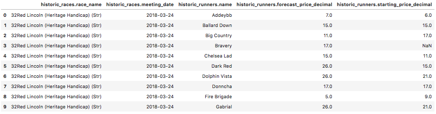
Converting Query Result to a Dataframe
Converting the query results (a tuple of tuples) into a pandas dataframe and printing the first 15 instances to check the conversion was carried out as expected. The pandas package will need to be imported in order to do this. This can be done by running ‘pip install pandas’ in the same way ‘pymysql’ was installed in the previous article below.
import pandas as pd
# for convenience of future queries the following code enables any SELECT query and conversion to dataframe without direct input of column names
start = query.find('SELECT') + 7
end = query.find('\n            FROM', start)
names = query[start:end].split(', ')

df = pd.DataFrame(list(rows), columns=names)
df.head(10)
If wanting to output the dataframe into excel/csv at any time, this can be done with either of the following commands:
df.to_excel("output.xlsx")

df.to_csv("output.csv")
DataFrame Pre-processing
Checking the dimensions of the dataframe
print('DataFrame Rows: ', df.shape[0], '\nDataFrame Columns: ', df.shape[1])

DataFrame Rows:  50643
DataFrame Columns:  5
Checking missing values of the dataframe
print('Number of missing values in each column: ', df.isna().sum())

Number of missing values in each column:  race_name            0
race_date            0
runner_name          0
forecast_price    1037
starting_price    4154
dtype: int64
Keeping rows with only non-missing values and checking this has worked
df = df[pd.notnull(df['historic_runners.forecast_price_decimal'])]
df = df[pd.notnull(df['historic_runners.starting_price_decimal'])]
df.isna().sum()

race_name         0
race_date         0
runner_name       0
forecast_price    0
starting_price    0
dtype: int64
Checking the new dimensions of the dataframe
print('DataFrame Rows: ', df.shape[0], '\nDataFrame Columns: ', df.shape[1])

DataFrame Rows:  46374
DataFrame Columns:  5
Approximately 3700 rows lost to missing data
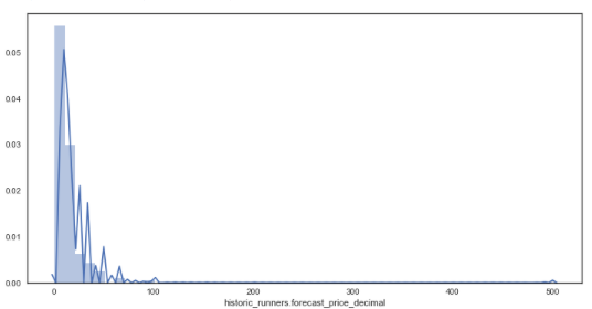
Producing a Distribution Plot
Seaborn is a statistical data visualisation package and can imported in the same way ‘pandas’ and ‘pymysql’ were installed. From this package different types of plots can be produced by simply inputting our data. (matplotlib can also be installed to adjust the plot size, titles, axis etc…).
The following code produces distribution plots:
* The distribution of the forecast price for all runners
* The distribution of the starting price for all runners
This allows us to have a visual understanding of the most common forecasted and starting prices and how these prices are distributed.
import seaborn as sns; sns.set(style="white", color_codes=True)
import matplotlib.pyplot as plt
%matplotlib inline

# '%matplotlib inline' this line enables plots to be shown inside of the jupyter environment
plt.figure(figsize = (12,6))
sns.distplot(df['historic_runners.forecast_price_decimal'], kde = True) # distribution plot for forecasted prices
plt.figure(figsize = (12,6))
sns.distplot(df['historic_runners.starting_price_decimal'])  # distribution plot for starting prices
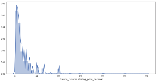
From the distribution plots it is very clear that the data is skewed due to some very large outsider prices of some horses. Wanting to investigate how the majority of prices are related to forecasted prices, these outsiders will be removed and the analysis will only focus on those with a prices below 16/1.
Having observed horse racing markets for a while it appears that many outsiders’ prices are very sensitive to market forces and can change between 66/1 and 200/1 with only little market pressure, therefore these data points have been removed for this analysis.
# creating new dataframe with prices <= 16/1
df_new = df.loc[((df['historic_runners.forecast_price_decimal'] <= 17.0) & (df['historic_runners.starting_price_decimal'] <= 17.0))]
sns.distplot(df_new['historic_runners.forecast_price_decimal']) # new distribution plot of forecasted prices
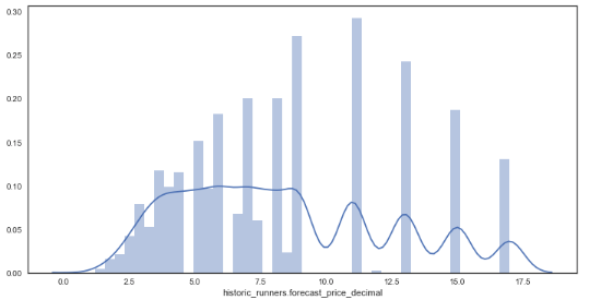
- From the data it can be seen that the prices appear discrete in some places yet continuous in others, this is likely due to the traditional way of bookmakers formulating odds, favouring some odds (e.g. 16/1) over others (e.g. 19/1).
- Also, the data looks far less skewed after the removal of large outsiders.
Producing a Scatter Plot
In order to have a look at how these variables may relate to one another, a scatter plot is constructed to plot both distributions against one another.
sns.jointplot(x="historic_runners.forecast_price_decimal", y="historic_runners.starting_price_decimal", data=df_new) # plotting forecasted price against starting price
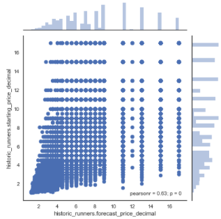
As seen, these variables appear to have a moderate to strong positive linear correlation with a pearson correlation coefficient of 0.63.
Due to the large difference between certain higher prices and many points being plotted on top of one another it can be difficult to visualise the relationships between the two variables. A heatmap can be a helpful tool in this case and can be simply produced by adding in the parameter ‘kind=”kde”‘.
sns.jointplot(x="historic_runners.forecast_price_decimal", y="historic_runners.starting_price_decimal", data=df_new, kind="kde");
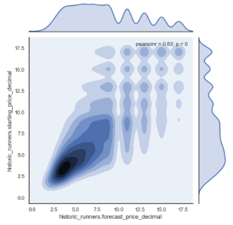
As shown, by the map, there is a high density of prices between 0 and 10/1 with most prices being between 6/4 and 4/1. The correlation appears to get somewhat weaker as the prices increase however this may in part be accredited to the use of more decimal places for lower priced horses.
Assessing Accuracy of Forecasted Prices
The given forecasted price can be used to assess the accuracy of more sophisticated predictive models. This can be done by comparing the accuracy of the new model to the accuracy of the forecasted prices.
The following code outlines a way of using the scikit learn package to calculate an R-Squared value. The R-squared is a measure of how much variance of a dependent variable is explained by an independent variable and is a way of assessing how ‘good’ a model is.
import sklearn
from sklearn.metrics import r2_score

print(r2_score(df_new['historic_runners.forecast_price_decimal'], df_new['historic_runners.starting_price_decimal']))

0.3075885002150722
This is a relatively low R-Squared value and it is likely to be improved upon with a more sophisticated model.
Betfair Price Analysis from Smartform Database
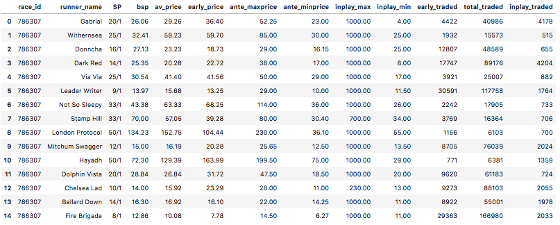
Another very insightful data source from Smartform is the historic Betfair prices table which can also be merged with the historic_races and historic_runners table. As shown below, there is a great number of variables that have been extracted from the Betfair exchange for pre-race and in-play price movements. (More can be read about this data source here).
query = ''' SELECT race_id, name, starting_price,
                   historic_betfair_win_prices.bsp, historic_betfair_win_prices.av_price, historic_betfair_win_prices.early_price,
                   historic_betfair_win_prices.ante_maxprice, historic_betfair_win_prices.ante_minprice, historic_betfair_win_prices.inplay_max,
                   historic_betfair_win_prices.inplay_min, historic_betfair_win_prices.early_traded, historic_betfair_win_prices.total_traded,
                   historic_betfair_win_prices.inplay_traded
            FROM historic_races
            JOIN historic_runners USING (race_id) join historic_betfair_win_prices ON race_id=sf_race_id and runner_id = sf_runner_id
            WHERE (CAST(historic_races.meeting_date AS Datetime) BETWEEN '2018-01-01' AND '2018-12-31')
                   AND
                  (historic_races.race_type = 'Flat')
        '''
cursor.execute(query)
rows = cursor.fetchall()

df_bf = pd.DataFrame(list(rows), columns=['race_id','runner_name','SP','bsp', 'av_price', 'early_price', 'ante_maxprice', 'ante_minprice', 'inplay_max',
                                       'inplay_min', 'early_traded', 'total_traded', 'inplay_traded'])
df_bf.head(15)
Similar to before, analysis can be carried out on the early price and the starting price but this time using Betfair prices, to assess if there are still similar results on the Betfair Exchange.
import seaborn as sns
%matplotlib inline
# 'matplotlib inline' this line enables plots to be shown inside of a jupyter environment
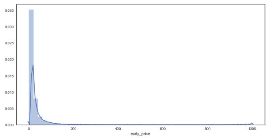
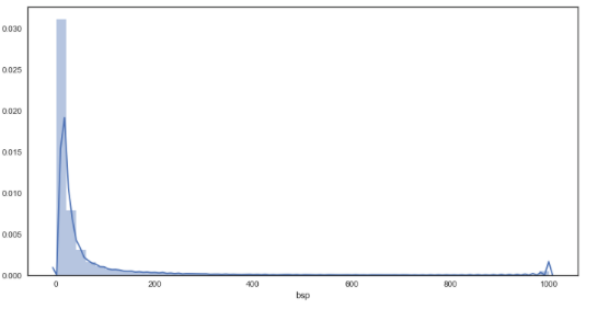
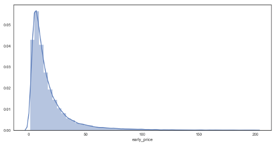
df_bf['early_price'] = df_bf['early_price'].astype('float')
sns.distplot(df_bf['early_price']) # distribution plot for early prices
df_bf['bsp'] = df_bf['bsp'].astype('float')
plt.figure(figsize = (12,6))
sns.distplot(df_bf['bsp'])  # distribution plot for starting prices
df_bf_new = df_bf.query('early_price <= 200 & bsp <= 200') # creating new dataframe with prices <= 200/1
plt.figure(figsize = (12,6))
sns.distplot(df_bf_new['early_price']) # new distribution plot of forecasted prices
plt.figure(figsize = (12,6))
sns.distplot(df_bf_new['bsp']) # new distribution plot of forecasted prices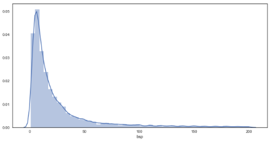
As seen from the graphs, the plots are much smoother in comparison to the bookies’ prices, suggesting a greater granularity in the prices on offer through Betfair. In regards to the distributions, there appears to be little difference between bookmakers and betfair starting prices from visual inspection.
sns.jointplot(x="early_price", y="bsp", data=df_bf_new) # plotting early prices against starting prices
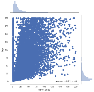
Again, there appears to be a moderate to strong positive linear correlation with a pearson correlation coefficient of 0.71. This increase (from 0.63) is to be somewhat expected given that early prices are being investigated instead of forecast prices. This finding may suggest that early prices are slightly more telling of what the starting price will be (compared to forecast prices).
It should also be noted that there are many really low early prices less than 1, compared to no Betfair starting prices within this range. It is believed that this may be caused by some markets having low liquidity in their early stages and lack of a fully priced market at this point. In order to investigate this further, the effect of overround in these early markets has been analysed below.
How does Overround differ in Betfair markets?
Another interesting aspect of these markets is the amount of overround – or ‘juice’ offered to punters. Overround can be defined as a measure of how much of a margin the bookmaker is taking out of the market in order for themselves to make a profit. Effectively, the higher the overround the worse the odds you are likely to get. In other words the odds are likely to be worse value compared to the true probability of an event happening.
From the analysis above, there were signs that early prices may have a greater overround than starting prices. The following data and analysis has been carried out to see if anything can be inferred about this.
Running the following query calculates the overround for every market (all flat races in 2018) by extracting the implied probability from the odds of each runner.
Overround = the sum of all implied probabilities from every runner – 1.
query = ''' SELECT race_id, SUM(1/historic_betfair_win_prices.early_price)-1 AS 'early_overround', SUM(1/historic_betfair_win_prices.bsp)-1 AS 'SP_overround'
            FROM historic_races
            JOIN historic_runners USING (race_id) join historic_betfair_win_prices ON race_id=sf_race_id and runner_id = sf_runner_id
            WHERE (CAST(historic_races.meeting_date AS Datetime) BETWEEN '2018-01-01' AND '2018-12-31')
                   AND
                  (historic_races.race_type = 'Flat')
            GROUP BY race_id
        '''
cursor.execute(query)
rows = cursor.fetchall()

df_bf_overround = pd.DataFrame(list(rows), columns=['race_id', 'early_price_overround', 'betfair_starting_price_overround'])
df_bf_overround.head(15)
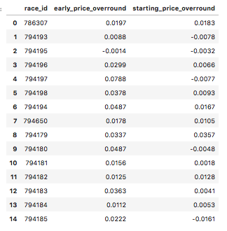
This dataframe consists of the overround for early prices and starting prices on the Betfair exchange for every market (flat race in 2018).
df_bf_overround['early_price_overround'] = df_bf_overround['early_price_overround'].astype('float')
df_bf_overround['starting_price_overround'] = df_bf_overround['starting_price_overround'].astype('float')
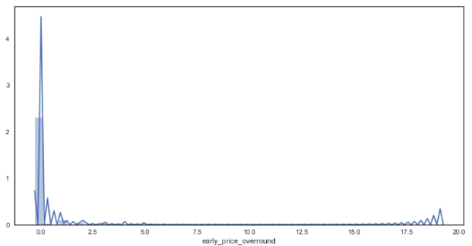
sns.distplot(df_bf_overround['early_price_overround']) # distribution plot for early prices
plt.figure(figsize = (12,6))
sns.distplot(df_bf_overround['starting_price_overround']) # distribution plot for early prices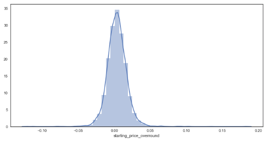
There appears to be some anomalies created via the calculation for early markets. This could perhaps be attributed to prices not yet being offered by the market for some horses within the market. To continue with the analysis, it has been assumed that any market with an overround less than 50% is incomplete and thus will only focus on markets with overrounds below this amount.
df_bf_overround_new = df_bf_overround.query('early_price_overround <= 0.5 & starting_price_overround <= 0.5')overrounds = list(df_bf_overround_new.columns.values)[1:3]
plt.figure(figsize=(12,7))
for overround in overrounds:
sns.distplot(df_bf_overround_new[overround])
plt.title('Distribution of Market Overrounds (Early v Starting Prices)', size = 22)
plt.xlabel('Overround %', size = 16)
plt.legend(labels = overrounds, loc = 'upper left', prop={'size': 14} )
plt.show()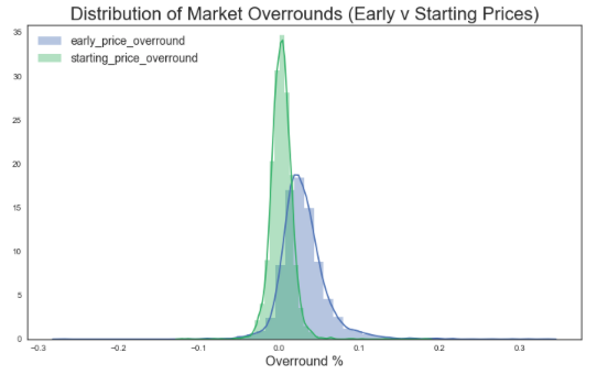
print('Average (mean) overround for early priced markets: ', df_bf_overround_new['early_price_overround'].mean())

Average (mean) overround for early priced markets:  0.03054834814308512
print('Average (mean) overround for starting price markets: ', df_bf_overround_new['starting_price_overround'].mean())

Average (mean) overround for starting price markets:  0.003256390977443608
from scipy import stats
stats.ttest_ind(df_bf_overround_new['early_price_overround'], df_bf_overround_new['starting_price_overround'])

Ttest_indResult(statistic=54.96055888606393, pvalue=0.0)
This T-test result (p-value of 0.0) confirms that there is a statistical difference between the means of each sample i.e. there is a difference between the averages of overround early and starting prices
Betfair starting prices appear to have approximately 0.0% overround on average, compared to an average 3% on their early prices.
From this it could be inferred that starting prices have a better overround on average than early prices – meaning that punters are in effect more likely to get ‘more for their money’ if entering the market directly before post time compared to betting on early prices. This may be because there is a greater amount of liquidity in the markets at this point in time.
Finally, how does starting price overround differ between bookmaker and exchange prices?
In order to retrieve the data to answer this question, two separate queries were run from the database for simplicity and then their dataframes concatenated as shown below:
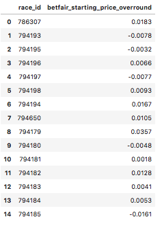
First, extracting the Betfair starting prices into a dataframe…
query = ''' SELECT race_id, SUM(1/historic_betfair_win_prices.bsp)-1 AS 'SP_overround'
            FROM historic_races
            JOIN historic_runners USING (race_id) join historic_betfair_win_prices ON race_id=sf_race_id and runner_id = sf_runner_id
            WHERE (CAST(historic_races.meeting_date AS Datetime) BETWEEN '2018-01-01' AND '2018-12-31')
                   AND
                  (historic_races.race_type = 'Flat')
            GROUP BY race_id
        '''
cursor.execute(query)
rows = cursor.fetchall()

df_bf_sp_overround = pd.DataFrame(list(rows), columns=['race_id', 'betfair_starting_price_overround'])
df_bf_sp_overround.head(15)
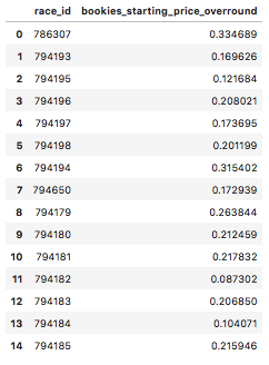
Next, extracting the bookies’ starting prices into a dataframe…
query = ''' SELECT race_id,  SUM(1/starting_price_decimal)-1 AS 'early_overround'
            FROM historic_races join historic_runners using (race_id)
            WHERE (CAST(historic_races.meeting_date AS Datetime) BETWEEN '2018-01-01' AND '2018-12-31')
                   AND
                  (historic_races.race_type = 'Flat')
            GROUP BY race_id
        '''
cursor.execute(query)
rows = cursor.fetchall()

df_bookies_sp_overround = pd.DataFrame(list(rows), columns=['race_id', 'bookies_starting_price_overround'])
df_bookies_sp_overround.head(15)
Then, merging both dataframes together, joining them on the variable ‘race_id’…
#Merging the two dataframes on race_id
df_merge_col = pd.merge(df_bookies_sp_overround, df_bf_sp_overround, on='race_id')
print('betfair df size :', df_bf_sp_overround.shape, 'bookies df size :', df_bookies_sp_overround.shape, 'total size :', df_merge_col.shape)

betfair df size : (4829, 2) bookies df size : (4863, 2) total size : (4829, 3)
(This merge had a loss of 34 rows. It appears the Betfair data had more races in this time period than bookies had priced up in this time period).
df_merge_col.head()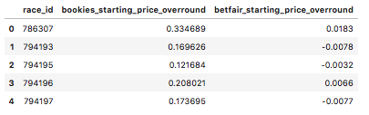
import matplotlib.pyplot as plt
overrounds = list(df_merge_col.columns.values)[1:3]
plt.figure(figsize=(12,7))

for overround in overrounds:
    sns.distplot(df_merge_col[overround].astype('float'))

plt.title('Distribution of Market Overrounds (Bookies v Betfair Starting Prices)', size = 22)
plt.xlabel('Overround %',  size = 16)
plt.legend(labels = overrounds, loc = 'upper left', prop={'size': 14} )
plt.show()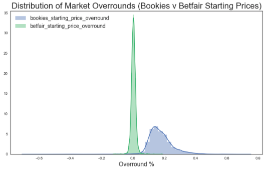
print('Average (mean) overround for bookies starting prices : ', df_merge_col['bookies_starting_price_overround'].mean())

Average (mean) overround for bookies starting prices :  0.17552602236487852
print('Average (mean) overround for Betfair starting prices : ', df_merge_col['betfair_starting_price_overround'].mean())
Average (mean) overround for betfair starting prices : 0.0035572168150755853from scipy import stats
stats.ttest_ind(df_merge_col['bookies_starting_price_overround'].astype('float'), df_merge_col['betfair_starting_price_overround'].astype('float'))
Ttest_indResult(statistic=152.77780026940124, pvalue=0.0)This T-test result (p-value = 0.0) confirms that there is a statistical difference between the means of each sample i.e. there is a difference between the averages of bookmaker and exchange starting prices
As shown above, bookie’s had a much greater overround (for starting prices) of approximately 17% compared to Betfair’s 0%. This reflects a large difference in value between the two betting mediums, reflecting that you are likely to find much better odds through betting on Betfair than with bookmakers, and to do so just before post time (in the large majority of cases).
Further analysis could look into if these findings holds true for all price ranges (and if the same results are found across different market types, not just a sample of data from 2018 flat races).
I definitly agree with the article findings that you get way better odds if you place your bets just before post time. To be presise I would say about 80% of trading activities happen at the last 5 minutes before the race starts; therefore, the book being closest to 100% at that time. However even though I am not trying to defend bookies I would like to bring couple of things, which need to be considered when making an argument on where you get better value once it comes to Betfair. 1. You pay 5% comission on your winnings. 2. In the long run you get even bigger commission in form of premium charges, which could get up to 70% of your winnings.