
New: Daily Trainer Stats – How Today’s Runner Fits the Trainer’s Patterns
By colin on Monday, April 13th, 2026When we built Smartform back in 2007, the aim was to make it possible to work with racing data in a flexible way—combining variables, testing ideas, and building your own systems, apps and models.
Smartform still allows you to dig into the data—building your own variables and uncovering insights that aren’t immediately obvious.
But the reality is:
• Not everyone has the time
• Not everyone wants to code
• And even then, interpretation still matters.
A New Look at Trainer Patterns
One of the most interesting areas we’ve explored with Smartform over the years is trainer behaviour.
Patterns around:
• when horses are run
• how long they are rested
• what type of races they are placed in
…can all be measured, and over time they tend to be repeatable.
That’s where Daily Trainer Stats comes in. We’ve taken that approach and built a view that links the trainer’s historical patterns directly to today’s runner, using Smartform data and additional modelling layered on top.
What the Feature Shows
For every race, you are presented with:
• A sortable table of trainer statistics
• And a set of box plots underneath, specific to each trainer
The table is built from the Smartform dataset daily_trainers_insights, with all figures calculated on a “to date” basis—so they reflect exactly what would have been known at the time.
Each row gives you a structured view of the trainer’s performance:
• Mean / Median PRB (percentage of rivals beaten)
• Recent form (21D / 42D)
• Course, distance and C&D performance
• Handicap vs non-handicap performance
On its own, that already gives a solid overview.
But the key addition is how that information is extended in the charts.
The Box Plots: Adding visual context to the numbers
Below the table, each trainer has a set of box plots showing how their runners have performed historically.
These are grouped by:
• Age of the horse
• Days since last run (DSR)
Each box shows the distribution of % rivals beaten (PRB) for that trainer under those conditions.
And then, for today’s race:
👉 The current runner is placed directly into that distribution (highlighted in red)
This is the important step. Instead of looking at general trainer stats, you are looking at:
👉 How this trainer has performed with this type of horse, under these conditions, compared to all comparable runners from that trainer
How To Read The Charts
You don’t need to overcomplicate it.
Each box gives you three useful pieces of information:
• The median line → typical level of performance
• The height of the box → how consistent that performance is
• The whiskers → how wide the range of outcomes is
Then you look at where today’s runner sits within that.
In practical terms:
• A higher median suggests the trainer tends to outperform the field in that setup
• A more compressed box suggests those results are consistent
• A taller box or longer whiskers suggest more variability
What you are trying to judge is not just how good the trainer is—but how suitable today’s conditions are for that trainer.
A Worked Example: The First Race on Grand National Day
To show how this works in practice, we can look at the opening race on Grand National day, run at 12:45.
This was a Grade 1 novice chase—a race type where:
• the horses are still developing
• form is less complete
• and differences in trainer approach can be more revealing
Step 1: Shortlisting Candidates Using the Table
A straightforward way to begin is by sorting on 21-day PRB, to focus on trainers currently in form.
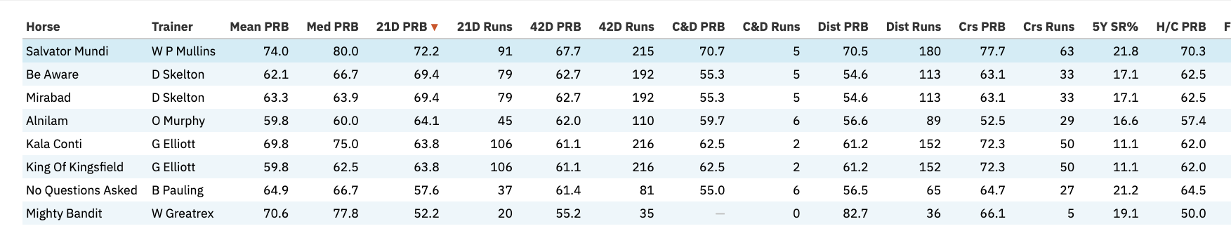
From the table (see screenshot), the top runners were:
• Salvator Mundi (W P Mullins)
• Mirabad (D Skelton)
• Be Aware (D Skelton)
That gives a manageable shortlist to examine in more detail.
Step 2: Looking at each horse’s profile
Within the charts for each race, you’ll find the individual horse profiles according to trainer patterns, in the case of our shortlist, some grainy screenshots below (see the app for full resolution!)
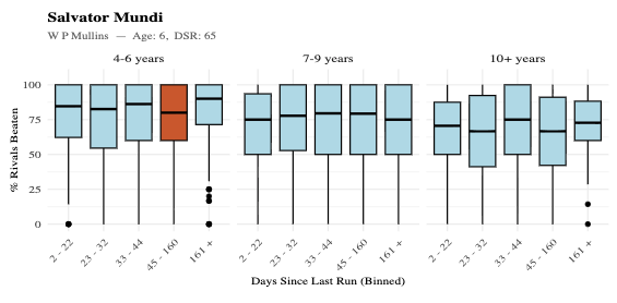
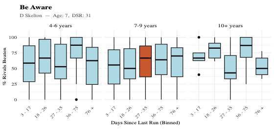
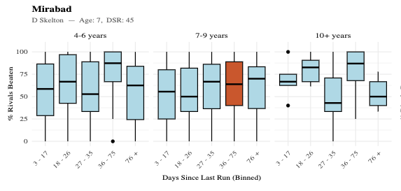
Rather than over-interpreting the charts ourselves, we presented them to ChatGPT with a simple description of the data and asked for an objective read. The result:
Salvator Mundi
From the chart:
• The distributions sit consistently above 50 PRB
• The median levels are strong across most segments
👉 This reflects a high baseline level of performance, regardless of exact conditions.
Mirabad
Looking at Mirabad’s highlighted position (orange box in chart):
• He sits in the 7–9 year-old group (column heading)
• With a mid-range break (DSR bin on x-axis)
In that segment:
• The box is relatively compressed
• The median is solid (mid-60 PRB range)
• The range of outcomes is not especially wide
👉 This indicates a consistent and repeatable level of performance under these conditions.
Be Aware
Also from the Skelton yard, but under slightly different conditions (see adjacent highlighted position):
• Similar overall level
• But the box in the relevant segment is taller
• With longer whiskers
👉 This suggests the trainer can produce strong results here, but with more variability in outcomes.
Step 3: Interpreting the Profiles Together
At this point, using both the table and charts, the prognosis for the race was as follows:
• Salvator Mundi
→ strongest overall profile
• Mirabad
→ consistent, well-aligned setup
• Be Aware
→ similar level, but less predictable
That gives a clear structure to the race before considering anything else.
The Race Result
• 1st: Mirabad (50/1)
• 2nd: Salvator Mundi (8/11)
• 3rd: Be Aware (10/1)
At the prices, Mirabad stood out as the runner whose profile was strongest relative to the market, at forecast odds of 33/1 (starting price 50/1).
What the example shows
The point here is not that the feature “found” a 50/1 winner.
It’s that, before the race:
• Mirabad was operating in a strong and consistent trainer setup (as shown in the chart)
• Be Aware, although similar in the table, had a more variable profile (taller box, longer whiskers)
• Salvator Mundi had the strongest overall profile, reflected in the market
The difference between Mirabad and Be Aware is particularly instructive.
From the table (top section), they appear quite similar.
From the charts (bottom section), you can see:
• one sits in a more stable, repeatable performance zone
• the other in a wider, less predictable range
That distinction is not obvious from summary statistics alone.
Where This Fits
All of this is built from the same Smartform data.
If you want to go further—build your own metrics, test ideas, or explore different angles—Smartform enables that.
What Daily Trainer Stats does is take one part of that work and present it in a way that can be used quickly, across every race.
Final Note
Trainer patterns are only one part of the picture.
You still need to consider:
• the horse itself
• the opposition
• a broader set of historical statistics, all of which are available in Smartform
But being able to see trainer angles very clearly as a unique starting point is a useful angle, in particular whether a runner is operating in a situation where the trainer has historically performed well.
For now, Daily Trainer Stats is available to all members, so you can explore the feature and see how it fits into your own approach.
Over time, it may become part of the subscriber only offerings, but for now it is there to be used and assessed in real conditions.